
In the last year, the artist/illustrator Ioannis has been an integral part of two of the best hard rock books published — Fade To Black and Get The Led Out.
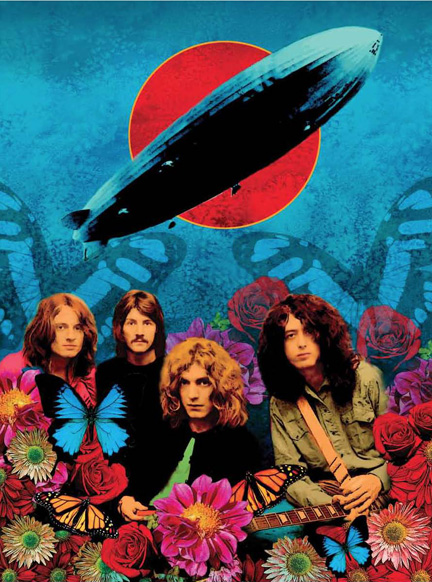
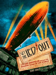
Get The Led Out — based on Carol Miller’s syndicated radio show of the same name — is a striking coffee table book packed with Zeppelin facts, interviews, iconic photos and beautiful artwork by Ioannis.
In an interview conducted for Goldmine magazine, Get the Led Out author Denny Somach remarked that Ioannis’ work for the Zep book was as good as Shepard Fairey’s visual campaign for Celebration Day — the mammoth CD/DVD release of Zeppelin’s 2007 O2 show.
 Ioannis gave Powerline a few comments about his work on the Zeppelin book, Get the Led Out.
Ioannis: The way [Get the Led Out] started was that I had finished doing Fade To Black and I hadn’t seen Denny [Somach] in a few years, so when we met — and we had done so much work together in the past — I said to him, ‘What are you doing now?’ He said, ‘I’m writing this Zeppelin book. I probably put it out in paperback or something.’ I said, ‘Wait. Let me see what this looks like.’ And I told him to let me set up a meeting with my publisher because I was just finishing my book. And I said I think they were going to love this because they’re into doing music books.
So, I brought [Somach] to my publisher and they saw the stuff and obviously went gaga over it. And I said, ‘Listen, let’s make this like the ultimate Led Zeppelin book.’ And the deal came really fast because obviously there was inherent value, not knowing at the time that Zeppelin was going to be putting out this film [Celebration Day] and everything. That was serendipity in the making. The way [Somach] sold it was that he wrote a two-page synopsis, and I just did a comp for the front cover. And book publishers do everything, literally, by-the-book (laughs). They’re always worried. I had to fight tooth-and-nail to design the cover for my own book (Fade To Black) because their thing was ‘We know you’re a great record cover designer, and you do great movie posters, but you’ve never done a book.’ And I’m like ‘It’s not that hard.’ I know my audience. I know what they are going to like. So, they said, ‘What are you envisioning?’ and [Somach] said, ‘Well, there’s gonna be interviews. There’s gonna be paraphernalia… ‘ But they really had to see it. They really had to see what it looked like. So when I made the presentation they said, okay, you’ve got a deal.
My editor, she was just extremely nervous, you know. I remember showing her the first pencil sketches and she was like ‘Can it be more defined? Can you tell me what’s going on?’ And I told her I don’t do pencil sketches. I just do the paintings. And she was like “Ah, okay.’ It wasn’t until she saw the first two or three paintings that it calmed down and they were all happy. And Denny pretty much gave me free reign to just do what I wanted. He just said, ‘Do something contemporary.” But the concept for me, the way I did it, was that [Zeppelin's] the quintessential ’70s band. To me, with the artwork, I had to adjust my style to fit that. The artwork should look like mid-’70s record covers. If you look at Zeppelin’s stuff — circa 1974, and what was coming out at the time — one of the most popular things being done were black and white photos being shot. And these were the pre-Photoshop days, of course — that were composed on a board and then reshot, and then going in there with an airbrush and dyes and inks and treat the photos so that they had a surreal look to them. You look at Ziggy Stardust and even some of Roger Dean’s work, Pink Floyd … it was specifically what I focused on, the way they did it. If you go back and look carefully, I wanted the artwork to have that mid-’70s look. I wanted the book to have that feel to it. When we did the cover, you’ll notice the paper they printed it on, the glossy paper. I’m really happy that the design of the book came out that way because I wanted you to have that experience. I think if the book was designed very contemporary … You see how magazines and things are being done right now, very sleek and neon photos — and I love the style, don’t get me wrong, but that whole Shepard Fairey look that’s now being run into the ground, you know the black and white graffiti poster art, the Obama campaign — if the graphics were done like that, I think it would take away what this book was about. So I consciously did the artwork like that and that’s where I looked at black and white photographs of sessions with Zeppelin and basically scanned them and reshot them and redesigned them and then went in and pasted these on a canvas and then went into it with inks and colors and airbrush and then rescanned them again and tweak them in Photoshop and that was the whole process of how this was done.
 If it was someone else, I’d do it differently. I know you’ve seen my covers and I do everything from traditional airbrush paintings like the Fates Warning stuff and Metal Blade stuff to stuff that’s similar to what Hugh Syme did for Rush or what Storm Thorgerson did for Pink Floyd — photo compositions that are done in Photoshop and given the whole surreal look. I think it was more trying to emulate mid-’70s record covers. And in a weird way the retro became contemporary (laughs).
Powerline: What the artwork captures so well is the mystique of Zeppelin. You know, in the ’70s, it isn’t like it is now, with social networking and the internet, you are constantly fed images of bands and celebrities. Back then, people were dying to know what Zeppelin were like, what they looked like … just seeing images of the members. Everything had a very mysterious feel to it and that was part of the appeal.
Ioannis: I think you’re dead-on target. Obviously, in every generations there are positives and negatives but one advantage that these bands had was the mystique around them because, basically, think about it, there was now way you could see them. Forget about who they were, you couldn’t even really get to see what they looked like until you went to the concert. All you saw were some photos like an occasional article in the music magazines, if you bought a music magazine. So these bands — Yes, Pink Floyd, Sabbath, Zeppelin — they were like mythic gods. They would appear onstage and you’d see them in the flesh for the first time, you’d just go nuts. And then the mystique could be built by the images on the record covers. You created this aura around them.
All of the above artwork is by Ioannis and is featured in the book, Get the Led Out.